How to select and combine colors
Choosing the right colors for your PowerPoint presentation can quickly become a surprisingly difficult task. This is immediately noticeable when color combinations in presentations do not look good, but it is more difficult to determine what exactly is done wrong. If you don't know where to start, here are a few things to keep in mind the next time you start making presentations. Let's talk about colors to avoid, contrast levels and color combinations.
What Not to Do
Transitional color - Headache
Transitional, or they are also called vibrating, are combinations of colors that give the illusion that they are vibrating on the screen. Not only do they look bad, but they can actually cause headaches and have been known to even make some people nauseous. If you need to use bright colors, always use them with a neutral background.
Low color contrast
A low contrast between background and text may well be appropriate if you are designing for high-quality printing or if you will be running a presentation on a computer monitor. If you will be displaying your presentation on the screen using a projector, remember that the projector is limited in colors. Therefore, colors with little difference or low contrast may become invisible. Examples of low contrast are when you have a blue background and red font - it will ripple. Or a yellow background and pink font... I recommend always using high contrast colors when creating a presentation that will be viewed on a projector.
Black and white
Print design can look professional and elegant in black and white, but in a presentation, black and white usually look boring and as if there was no time to design the presentation. If the presentation needs to be done in black and white, I recommend adding a slight gradient to create some depth/diversity.
The emotional power of color
Also, when choosing the main color of the presentation (background or text), it is necessary to take into account the emotions that colors evoke. So, for example, if you are presenting an intimate services salon, you can safely make a presentation in red, but for the presentation of a family vacation club, red in large quantities will be completely inappropriate. Why? See color description below.
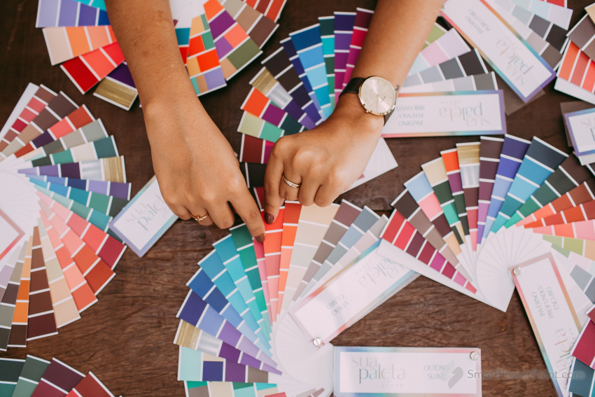
Color combination
Perhaps the most difficult task in creating presentations is the problem of color combinations. Let's start with the fact that the presentation should have no more than three primary colors. Here the law of style is already intertwined - no more than three primary colors, because pictures will be added and a rainbow may turn out.
Many people face the problem when they cannot find interesting combinations of colors and as a result, they get a standard black font and a light blue background. Again, there are many sites on the Internet with ready-made color combinations for clothes, but you can safely use this information for your presentation. Here are some examples:

What Not to Do
Transitional color - Headache
Transitional, or they are also called vibrating, are combinations of colors that give the illusion that they are vibrating on the screen. Not only do they look bad, but they can actually cause headaches and have been known to even make some people nauseous. If you need to use bright colors, always use them with a neutral background.
Low color contrast
A low contrast between background and text may well be appropriate if you are designing for high-quality printing or if you will be running a presentation on a computer monitor. If you will be displaying your presentation on the screen using a projector, remember that the projector is limited in colors. Therefore, colors with little difference or low contrast may become invisible. Examples of low contrast are when you have a blue background and red font - it will ripple. Or a yellow background and pink font... I recommend always using high contrast colors when creating a presentation that will be viewed on a projector.
Black and white
Print design can look professional and elegant in black and white, but in a presentation, black and white usually look boring and as if there was no time to design the presentation. If the presentation needs to be done in black and white, I recommend adding a slight gradient to create some depth/diversity.
The emotional power of color
Also, when choosing the main color of the presentation (background or text), it is necessary to take into account the emotions that colors evoke. So, for example, if you are presenting an intimate services salon, you can safely make a presentation in red, but for the presentation of a family vacation club, red in large quantities will be completely inappropriate. Why? See color description below.
- Red is a very active color that is associated with healthy ambition, movement, and determination. Red expresses impulse, perseverance, passion, danger, love.
- Orange is the color most commonly associated with business and career. Orange color causes a certain enthusiasm, disposition towards oneself. This color is associated with courage, enthusiasm, leadership qualities.
- Yellow is associated with wisdom, mental activity, intelligence, respect and wealth.
- Green is associated with life, birth and nature as it symbolizes growth, development, prosperity and well-being. Green is able to relax us, improve vision and restrain emotions.
- Blue is most often associated with honesty, frankness, devotion. Blue is a peaceful, serene and soothing color. However, if we are talking about dark blue (closer to black), then this color can evoke sadness and depression.
- White color energizes us, harmonizes, expands possibilities. White color is associated with truth, frankness, innocence, "divinity".
- Black is associated with death, rebirth and transition. In fashion, this color means power and strength, as well as submission to beauty.
- Brown is often seen as a neutral color, neither warm nor cold. This color symbolizes stability, reliability, support, reality.
- Purple - this color is associated with luxury, elegance, royalty, on the other hand, it sometimes creates a feeling of artificiality. This color symbolizes intuition, spiritual and physical connection, inspiration.
- On the Internet you will find many sites with a detailed description of the psycho-emotional connection of color and our perception.
Color combination
Perhaps the most difficult task in creating presentations is the problem of color combinations. Let's start with the fact that the presentation should have no more than three primary colors. Here the law of style is already intertwined - no more than three primary colors, because pictures will be added and a rainbow may turn out.
Many people face the problem when they cannot find interesting combinations of colors and as a result, they get a standard black font and a light blue background. Again, there are many sites on the Internet with ready-made color combinations for clothes, but you can safely use this information for your presentation. Here are some examples:
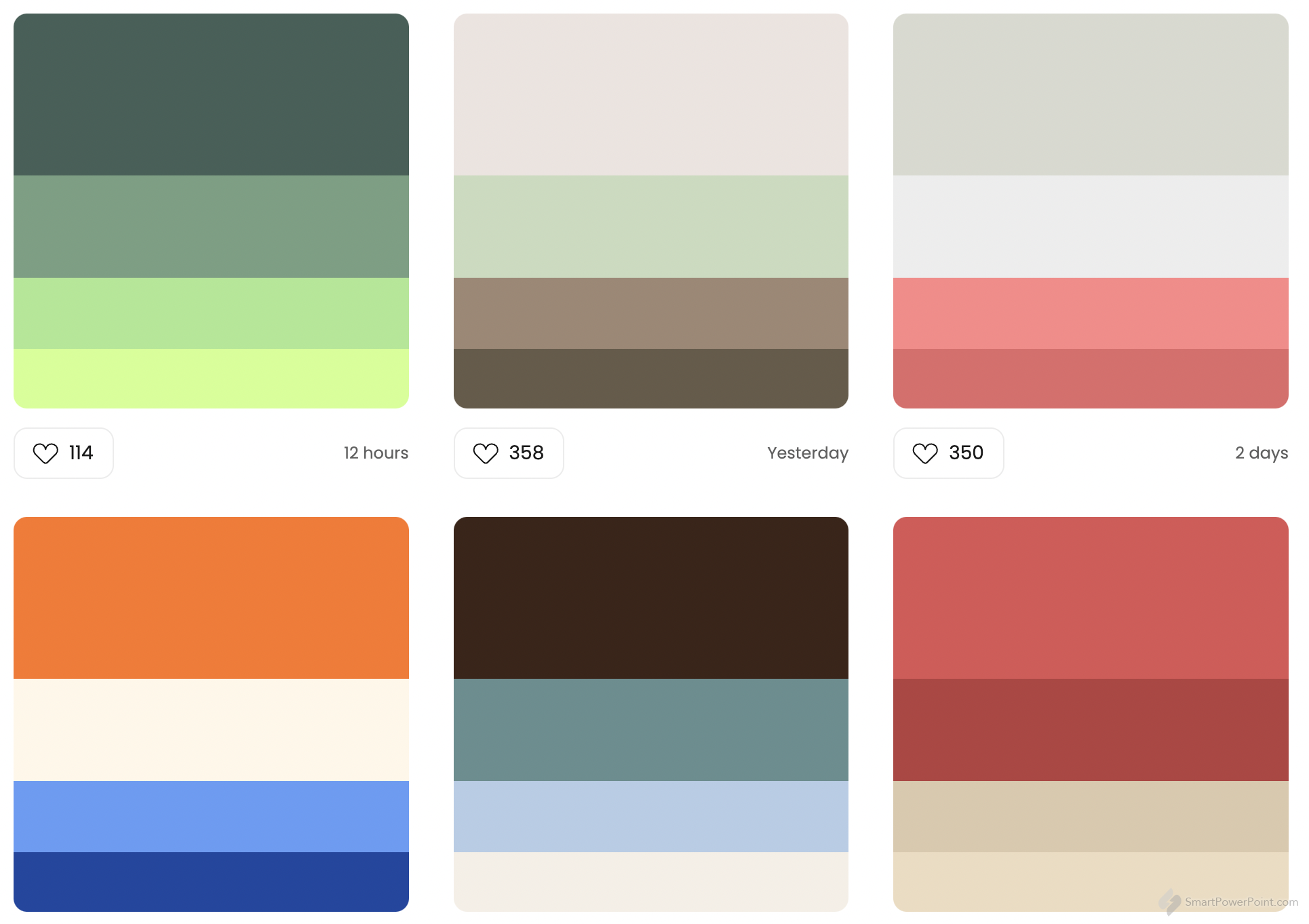
You can discover more color combinations at the https://colorhunt.co/
Share this article with your friends: